December 28, 2019

A Seat at the Table: The Chair as Aesthetic and Social Construct in Spartanburg


My last painting for our upcoming group exhibition in Spartanburg was finished shortly before the beginning of our holiday break. As with most of my work, the painting evolved and changed over time. The painting is somewhat larger than how I generally work, so it took a few weeks to complete, with plenty of opportunities to change my mind and add or subtract to the composition.

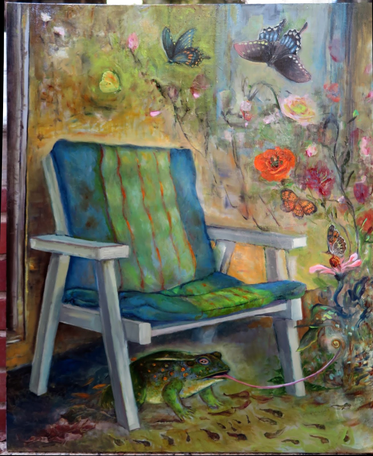
I had originally conceived the painting, Abandoned Porch with Chair, as a contrast between a black and white interior with a view of a world of vibrant color - much like the way Dorothy, in the film The Wizard of Oz, opens the door of her tonal world to reveal a colorful Oz. It seemed a fitting end to the old year with sanguine hopes for the new. To this end I made an underpainting in black and white and used colorful oil glazes of pure mineral pigments for the scene beyond the abandoned porch. After reading about the film, The Wizard of Oz, however, I found that the bucolic home scenes of Kansas were not filmed in black and white but in sepia tones, like an old photograph. This influenced the colors that I began to lay in over the black and white underpainting - introducing browns and ochres. The background I left with bright, almost garish colors, to impart a sense of a strong afternoon light. To keep the scene vibrant I changed the original black doorway to one of golden yellow.

The chair was painted several times. It was originally an abandoned rocking chair, but I changed it into something more sturdy. During several repaints, the chair acquired new upholstery based upon the African Kuba cloth designs that I had viewed earlier at the Stanback Museum here in Orangeburg.


In the original scene, there were various and sundry pieces of debris scattered along the surface of the dilapidated porch. I converted these into all my sketches of chairs that never made their way into paintings or finished drawings. It somehow felt cathartic to liberally sprinkle these emblems of unfinished work into my last painting of the year. The large drawings of chairs are in the works for certain, but will have to wait until March to be shown. I will post on their progress in January!

The exhibition, A Seat at the Table: The Chair as Aesthetic and Social Construct, will open on January 6 at the Artists Collective on 578 West Main Street in Spartanburg, South Carolina 29301. For more information call 864 706-2474. Visit their website at www.westmainartists.org 
Links to articles:
https://www.goupstate.com/lifestyle/20191222/artists-collective-to-show-chair-themed-artwork

December 10, 2019

My Women, My Monsters: An Interview with Professor Sarah Wyman

Just Updated with a more direct link:

My interview with Professor Sarah Wyman on my upcoming illustrated poetry book, My Women, My Monsters.  In this week's online journal, The Ekphrastic Review: http://www.ekphrastic.net/ekphrastic/my-women-my-monsters-dr-sarah-wyman-interviews-janet-kozachek-about-her-new-book


December 2, 2019

Transformations and Translations: The Art of Una Kim and Janet Kozachek

For our closing lecture at the I.P. Stanback Museum tomorrow, I will be telling stories not told before, discussing art work not show previously, and my upcoming book from Finishing Line Press, My Women, My Monsters.  I will have a preview copy and extra pages available.  I am happy to have yet another opportunity to discuss this enigmatic work that incorporates eastern with western influences. 

November 13, 2019

A Seat at the Table: New Painting with an Imagined Art Collection

Turning to revisions on older paintings, I have made something of this painting of Scot from about ten years ago. The painting was created from an original drawing I did as Scot posed in an old red wooden chair and holding a rock.

To update the painting, I changed the rock into red blocks and incorporated art work from my colleagues, Lee Malerich and Janet Orselli. The rocks that originally rested on the shelf behind Scot were transformed into brightly colored Orselli sculptures. The sculptures that I chose were Orselli’s Ladybug and The Doc is In. I chose them mostly to complete a red, blue and yellow color triad in the center of the painting, but they also add content as well. Although not visible in the painting, The Doc is In sports a small blue colored pawn from a collection of chess pieces.
 The oversize and overwhelming head on the makeshift blue couch serves to underscore the feeling of manipulation.

In order to use Ladybug, I had to turn the piece in my imagination so it would rest at the right angle on the shelf in the painting. Fortunately the painting is so small (9" x 9") any awkwardness in my having done this is mostly forgiven by scale.

The sculptural work on the floor of the painting has been influenced by Lee Malerich’s Build Your Wall, an essentially deconstructed chair. In this sense my new art work, has become an ekphrastic work - paying homage to the art of other artists. Perhaps there will be more of these ahead.

November 12, 2019

Book Marketing for the Introverted, Hesitant, Overwhelmed and Confused

 
When an artist or writer publishes a book, even a small chapbook like My Women, My Monsters, the work does not end there. In this age of self help, self promotion and self advocacy, the author is obliged to help find homes for her book children. These fledglings do not fly out of the nest and onto the bookshelves on their own. To this end I have been reading books on the marketing of books. I find the subject fascinating - if only in that this is something that I am not naturally good at, being inherently introverted, hesitant, and technologically somewhat confused.   I am reading these books with the same curiosity and admiration that I had reserved for that massive economics text I had mentioned in a previous blog - Thomas Piketty’s Capital in the 21st Century. I did not understand the equations, but admired people who could apparently keep such equations in their heads while simultaneously discussing the social issues that the math impacts upon.

Similarly, in reading about marketing, I can admire the ability that some artists and writers have to acquire and sustain an audience of followers, even though I don’t do that terribly effectively myself. I will address this and other questions from time to time because artists and writers are so very much on their own and need to learn from a variety of experiences as to what works and what doesn’t.

Today I found what might be called a niche market.  Finding one's audience is something that is not always immediately apparent to an artist or writer. But it is essential to figure out who one’s audience is and then make your work known to them. Once again, I make a disclaimer here because even doing this does not guarantee that a niche audience will also be willing to open their wallets for you. Ironically, so far, the niche audiences that have been recommended to me by the advice in the books I have been reading have not panned out ( over 55, women, etc) yet. What I did find was a place that specifically works with poets who write about visual art: The Ekphrastic Review.  For a very reasonable fee, I have posted my work there. I will post later when or if more comes from this.  As for now, I see that I am in good company with a book about the Canadian Group of Seven, that I might have to buy.

November 11, 2019

November 9, 2019

A Seat at the Table: Cafe Bebe Gets a New Chair

A patron lent me an odd little chair that someone had made a homemade dress for. She thought it might inspire me to make a painting of it for the upcoming group exhibition, A Seat at the Table: The Chair as Aesthetic and Social Construct. As my opening line suggests, I found the chair a little strange and discomfiting. I found it confusing as well. I was not certain if the dress was made for the chair or the chair for the dress. And there was this tangle of ribbons sewn to the crest and arms of the chair which obfuscated the form.


For months I could not figure out what to do with it. Even though the patterns were attractive, the form seemed to defy any definition, no matter what lighting was applied. And what would this chair, which appeared to be made for a doll, mean? Generally the chairs I had been using served a narrative, and there was nothing about this chair that inspired me to want to tell a story, imagine a story, or recall an interesting piece of history.

As I was restoring what was left of my old painting series, The Monologues, I came across one with a scene of a couple in a Café in Germany. Some of the paint had been pulled off the surface while it was in storage and it was badly in need of repair. So I carefully removed the varnish, let it dry a few days, then gave the paint a light sanding.

The painting, Café Bebe, was used to illustrate a poem about a painting hanging in that bar in Konstanz, that, for some reason, made me feel mildly annoyed. The painting was of a flock of winged cherubs frolicking along a river of emerald green. Looking back on that poem written years ago I must have been more repulsed by the art than I remember because I referred to all those pink putti as "winged hams." Revisiting that phrase made me laugh at my utter inability to understand putti appeal.

It then occurred to me that the little doll’s chair that confused me belonged in the corner of the painting that included an art work that my sentiments could not comprehend. The undefined form was made slightly more definite by manipulating the light in ways that did not coincide with reality - but made a seat discernable.

Some of the people viewing the new painting liked the little chair and it presence created a pleasant narrative for them. Secretly, I thought that a winged ham might just fit on the seat!

November 7, 2019

A Seat at the Table: Chairs in the Wild

Exhibiting in Charleston at the Nina Liu and Friends Gallery brings back fond memories. Nina Liu often held exhibitions on specific themes: the trees, the angels, the hearts. As with most of these exhibitions, I would enthusiastically produce a body of work, sell about one eighth of it, and then bring home the rest for storage. Eventually I might sell a few more of these over the years, but there generally remained four or five painting that would refuse to leave home. The tree exhibition was no exception. I included in this exhibition some paintings of truncated trees that I had made in Holland. Three of these were somewhat intimidating, made even more so because I gave them titles like Tree of the Wicked Spring. I have not decided what to do with Wicked Spring yet, but two of the paintings of this trilogy have been re-purposed for the upcoming exhibition A Seat at the Table: The Chair as Aesthetic and Social Construct, at the newly designed venue, Artists Collective, Spartanburg.

The pale winter scene in Holland is now embellished with the mysterious presence of an ancient Egyptian chair in the background, and an overturned chair in the foreground. The former came from my studies at the Metropolitan Museum in New York, the latter from an old Charleston chair from our private collection. The painting is still haunting but a little less spare.

My painting, Truncated Trees, now has an addition of an African chair from the permanent collection of the local museum here in Orangeburg - the I.P. Stanback Museum. I needed a very strong structure as a focal point to balance those massive trees and the African chair seemed to suit. I liked the way the top piece was fashioned from a single branch.


Just one more or more two revised paintings to go before I start painting and drawing new compositions again.

November 2, 2019

A Seat at the Table: The Red Thread Gets Reinvented

This little square painting used to house just a solitary man squatting on the floor and looking out at the viewer with a quizzical expression. His home was a mass of wild and wooly red lines. The painting was originally completed for the poem, The Red Thread, from my poetry book manuscript recently given the new title of A Rendering of Soliloquies. (The new title seems to lend itself to typos so I have some minor regrets about this update. It almost went off to the last publisher with a glaring spelling mistake right there front and center in the title - not the best way to make a first impression).

My second update was in the painting itself. With the addition of a chair, the painting will now serve a double duty. The chair entered because this will now be used for the upcoming exhibition in Spartanburg in January 2020: A Seat at the Table: The Chair as Aesthetic and Social Construct.

This particular chair was patterned after a late eighteenth century mahogany American armchair that I had sketched from life at the National Gallery.  Including this chair from the days of our founding fathers served as a good contrast, with its orderly, rational and upright form, to the chaos of swirling red lines in the squatting man’s environment.

Early American chairs had symmetrical structures formed around a centerpiece called a spat. The spat was carved into decorative designs that often depicted charming and harmonious musical instruments like harps or lyres. For this chair I made a design where the spat should be that is in the shape of an American dollar sign. This dollar sign crept into the work as a product of present concerns and recent reading.

I had just finished reading Thomas Pikkety’s Capitalism in the Twenty-First Century, a brilliant work that encompassed more than two hundred years of economic trends. In a carefully researched analysis, this 750 page tome tackled the question of why societies tend towards wealth inequalities and proposed some solutions to prevent this from becoming so extreme as to be socially destabilizing. At the same time, I had been ruminating on tackling a complicated and prickly financial transaction. As a result, the dollar sign in the chair has shifted from where it should be as a center spat, and has moved rightward. Something to ponder!


November 1, 2019

My Women, My Monsters: The Duchess of Lists

The Guenall Lioness, mentioned several blog posts ago, was a monster misidentified. Other monsters from my chapbook, My Women, My Monsters depict monsters within. Many can relate to the feeling of not living up to internalized demands. I’m no exception. It occurred to me that one manifestation of this was my compiling impossibly long "to do" lists, which would only exacerbate feelings of inadequacy at the end of the day when ruminating upon all those items not checked off the list. Enter the monstrous, "Duchess of Lists." Like the lists on her page, the poem also spilled out onto a second page. This left a blank area in need of a second illustration. For that I made a second detail drawing of the Duchess’ sleeve. But if you look carefully, Edvard Munch’s "Scream" is hidden up her sleeve.

A few lines from the Duchess:

The Duchess of Lists
is the sorceress of the clock’s hours.
She ties strings to your ankles,
adding weights for good measure
that hold you back to slow you down
as she speeds up time.

To reserve your copy of "My Women, My Monsters" follow the link to Finishing Line Press:  https://www.finishinglinepress.com/product/my-women-my-monsters-by-janet-kozachek/

October 31, 2019

The Woman With Two Expressions: A Halloween Portrait

I once knew a woman named Frankie. Now, that sounds like the opening line of a limerick. So before I tell my story I must first get that out of the way:

I once knew a woman called Frankie

who would smile when she gave you a spanky

For the tears that you’ld shed, she’ld just shake her head

and not even offer a hanky

The real and not the literal Frankie was someone I knew decades ago as an ex-patriot. She had a peculiar habit of paying a compliment, then she would immediately follow the compliment with a second observation that would completely nullify the previous positive remarks. It would go something like this:

Compliment: "You know, I think that you are an exquisitely beautiful person, both physically and intellectually."

The Downer: "But I’m often told that I have bad taste and am a poor judge of character."

But Frankie would not leave it at that. She would follow this antithetical couplet with a look - a look that I would not have thought humanly possible had I not seen it with my own eyes. After delivering this dual observation, she would look you right in the eye and smile, but with only one side of her face. The other side would sport a grimace. Seeing both sides at once was confusing to process. Who could tell which side was for you? Both perhaps. Today I tried to immortalize that look with this little portrait that seems appropriate for Halloween. Scary, yes?

In order to see the two expressions clearly, cover one half of the face at a time with a piece of paper.

October 23, 2019

The Book of Marvelous Cats New Activity


One benefit of publishing a second book is that it rekindles interest in the first one.  This next book signing event is for a benefit:

The Book of Marvelous Cats is supporting Authors for Literacy, a fundraiser for Turning Pages adult literacy tutoring at Lexington County Library. For this special one day event, The Book of Marvelous Cats will be available at the bargain price of just ten dollars a copy. Come and meet the author, Janet Kozachek, who will personally sign and dedicate each book to you or to a designated recipient.

Where: Lexington Library 5440 Augusta Rd. Lexington, SC

When: 11 am - 2 pm Saturday, Dec. 7.

There will be twenty other authors there as well who will personally autograph their books for you or someone you want to give the books to.

October 15, 2019

My Women, My Monsters now available at Finishing Line Press

After numerous revisions, polishing of drawings, and a bit of luck, my illustrated chapbook, My Women, My Monsters, is now available through Finishing Line Press. The book is now available through their website. Follow the link here: https://www.finishinglinepress.com/product/my-women-my-monsters-by-janet-kozachek/  If you have trouble placing an order, then email the publisher at: flpbookstore@aol.com

October 13, 2019

A Seat at the Table: Crime Scene

Why would I name a painting of what looks like an innocent, even tranquil domestic interior, Crime Scene? My reasons are in three parts: a discovery, an epiphany, and a question concerning an annoying disappointment.

Part One: Discovery

I discovered a book about crimes some time ago in a bookstore in New York. I had not sought this book out. I had merely picked it off a shelf while I was waiting for my husband to arrive from another store. I started reading it and was struck by a strange crime story called "The Measure Man." The peculiar story was about a man who would break in to people’s homes with a tape measure and "measure" them. No one quite knew what to make of it. I can imagine the police questions and report:

"Did the suspect take anything?"
"No."
"Did he injure you?"
"No."
"Were you struck anywhere?"
"No."
"Did the suspect touch you inappropriately?"
"Hard to say."
"What happened exactly?"
"He measured me."

Even though the perpetrator had not assaulted the victims, apart from trespassing into their homes, the victims knew instinctively that there was something seriously wrong about Measure Man’s actions. And they were right. The story went on to relate how Measure Man eventually began to dispatch with his victims. One can only conclude that he was in fact "measuring them up" for the kill.

The odd story stuck with me, even many years later one evening when I was alone at home and resting on the couch. I was recovering from a bad virus and did not have the strength to make much art work. Yet my artistic eye was still active. Across the room from the couch I saw two chairs and a red tape measure stretched across them. The red tape measure worked well to unify the red threads of design in the upholstery of the foot at the base of the second chair. Everything was so nicely tied together. So I mustered up the energy to find my camera and took a photograph. I snapped the shutter and then shuttered slightly myself when the thought of Measure Man floated through my head.

Part Two: Epiphany

A few years later, I finished a small book and my publisher asked me to post it on Facebook. I replied that I was not on Facebook. ( I was on it for a few months back in 2008, decided I didn’t like it and left). But I acquiesced and opened an account. The year was 2016 and I found that I still had great doubts about social media and at times found it mortifying! But I attributed the spikes of stunning incivility to it being a tense election year. I subsequently remained on social media despite the occasional sniping because I decided that the benefits outweighed the negatives. I established a good network of artists, writers and scholars who have enriched my life, and I reconnected with old friends and relatives. So the benefits of Facebook outweighed the negatives, despite the fact that it turned out not to be especially commercially successful.

But do the benefits of social media outweigh the risks? Given a choice, I would much rather pay a monthly fee to Facebook than have my personal data harvested and sold to entities that wish to pester me with items to sell me and groups for me to join. And can we really be certain that our data might not ultimately be used for more nefarious purposes? We offer ourselves, body and soul, in our posts on social media and in return are... measured? So we continue to post our likes, our dislikes, and our preferences - all the while having some tamped down reservations in the backs of our minds, like the victims of Measure Man knowing instinctively that there was something dangerous about being physically tabulated. Does Measure Man now enter our lives through our computer screen instead of an unlocked door? I thought of my photograph and determined that I could allude to this when I finally painted it.

Part Three: What is the Measure of an Artist?

I painted "Crime Scene" in the same year as an incident involving an unfair measurement. The incident involved an art event that I discovered was allowing (mostly) male artists to price their work any way they pleased while limiting (mostly) female artists to rules restricting them to works of small sizes and cheap prices. They were obliged to essentially take a back seat to their (mostly) male peers. In my artistic response, I made a smaller, background chair in my final painting composition that alludes to this.

In my more official complaint I conceded that if the organizing party wished to have a divided exhibition, with one room for cheaper art and another for specifically honored artists, that they had every right to do so, but that this would have to be articulated in clearly defined written guidelines at the outset, rather than the somewhat nebulous statement that there could be some exceptions to the rules. Otherwise all artist should be treated equally. To do less would unfortunately reinforce a stereotype that female artists (and others simply less popular) are not as valuable or competent as their popular male peers who can command higher prices - especially since the venue was a well attended, prestigious event.

The unfairness did make me disappointed and somewhat cynical. I mentioned to a friend that perhaps I should turn up at their party with a tape measure to see if any artists were breaking the rules of their proscribed presentations. Then I immediately caught a chill thinking of Measure Man!

Rest assured that I took measured steps to address the inequity directly to the organizers involved rather than with surreptitious physical yardsticks and tape measures. Hopefully this will result in greater parity next year, with equal measures of space and remuneration.


October 10, 2019

My Women, My Monsters is about to be published

My illustrated chapbook, My Women, My Monsters, is being put together at Finishing Line Press as I write this. It is a short chapbook if you don’t count the illustrations. But it took a long time to write on account of the elaborate illustrations. These were completed with tightly woven pencil patterns in a broad tonal range. This required using a large array of pencils from 6H to 9B. It was time consuming but I got the effect that I wanted - designs that look similar to the graded ink painting that I learned long ago in the People’s Republic of China.

Most of the illustrations are designed to fit on the page opposite the poem which describes it. But some of the poetry stretched beyond the usual one page format. This created a conundrum for my first graphic designer who was helping me create PDF files for my book. What was to be done for the page opposite the remainder of a poem? The solution, also a bit painstaking, was to extract a detail from the original drawing and make a new, smaller drawing from that.  In redrawing the detail view, as seen here at right, I chose to embellish slightly so this is not an exact copy of the original.

An example of the overwritten page and the extra drawing can be found in my illustration for the poem, "Twinkle Tinsel Toe Fairy," a sardonic verse about magical thinking. Because the last verse describes the fairy’s magic wand, I decided to focus on that. And here is a fitting end to the line "....and "poof" they all are gone!"

October 7, 2019

A Seat at the Table: Pinocchio Comes Alive

My next painting for my upcoming group exhibition, "A Seat at the Table: The Chair as Aesthetic and Social Construct," was based upon an actual scene at an Italian restaurant not far from the Metropolitan Museum of Art. The name of the restaurant now escapes me (I don’t have my husband’s acumen for cognitive retention of personal culinary history - he remembers the time and location of just about every place he has eaten!), but the atmosphere was memorable. There was a wooden flag embellishing what looked like an enormous old fireplace. It took me a moment to recognize this as an American flag, as the stripes were blue and white instead of red and white. High above the flag, resting upon the mantel, or perhaps a very fancy wainscotting, was a wooden pinocchio. He cut a fine figure with his long nose and his painted eyes. He was dressed in red shoes and a blue shirt with red buttons. On his head he sported a tall, white pointed cap.

I was instantly taken by this wooden pinocchio, so while waiting for my meal, pulled out my sketchbook and made a quick drawing of him. The marionette seemed to have some age, which gave him some added quaintness. A quick Google search pointed to him being perhaps a vintage item from the 1960's.

As I worked with pencil on paper I wondered if there was a sardonic statement being made with this long nosed Pinocchio hovering over a blue American flag. I noticed that Pinocchio was dressed in red, white and blue as well. Certainly contemporary politics and media wars would make this juxtaposition rather apt, although not knowing the restaurant manager’s inclinations it would be difficult to ascertain whether right or left wing was being satirized here.

It took me a few months to finally paint this scene -I first saw it in August of this year. Apart from the delays of having other work ahead of this one in my studio pipeline, I just could not settle on whether this should be a drawing or a painting. I finally settled on a compromise by making a mostly black and white painting with black outlines. I thought of the muted tones and black outlines in the paintings of my former teacher, Leland Bell here.

While finishing up this painting, I listened to Bach Cantatas on Youtube. Perhaps fitting for a painting about duplicities, the Youtube cantatas were frequently interrupted by annoying ads from Epoch News. I guess their ad space that was revoked from social media platforms was reallocated to Youtube. It almost made me want to paint Pinocchio’s smile upside down.

I kept Pinocchio’s silly grin, however, but did change his eye, albeit partly by an uncoordinated accident. The eye, originally looking blankly forward, now cast a sidelong, furtive glance at the viewer. It was amazing how this tiny detail changed the entire tone of the work. Originally the painting was about chicanery - a nation fooled. With that eye upon the viewer, Pinocchio seems to now say, "And you as well, yes?"

The tall chair seen here was adapted from a work of art from the Metropolitan Museum of Art's furniture collection: The chair designed by Charles Rohlfs  (1853 - 1936) and Anna Katherine Green (1846 - 1935).  According to the museum sign, the pierced decoration on the tall back of the chair represents the cellular structure of oak - a bit of truth at the core of an otherwise duplicitous painting.

September 27, 2019

A Seat At the Table - Small Preparations

In preparation for my upcoming group exhibition, A Seat at the Table: The Chair as Aesthetic and Social construct, I am beginning by working on small previously completed paintings that could use an addition of a chair or an embellishment upon an existing one.

To this end I added a chair, as well as a small cat, to a painting of a woman seated at a table. The chair is an historic one, based upon my studies of wooden chairs from ancient Egypt. The chair was part of the collections at the Metropolitan Museum of Art and I thought that its black and white starkness would play out well against the black and white cat. In order to understand the structure of this particular chair, I spent some time at the museum sketching it, adoring this ancient object more and more the longer I studied it.


The small painting of the man with the large black down jacket was completed many years ago at a museum in Germany. He was seated across from a small, uninspiring stool, but with an intriguing glimpse into a small alcove with a stained glass window.

I began my hunt for exotic chairs at the Ontario Museum of Art in Toronto and was not disappointed by what I found. The African art collection housed an elaborately carved beaded Yoruba throne chair. This made its way into the small painting, almost overshadowing everything, yet curiously having a relationship to the colors in the stained glass window towards the interior of the painting.

Lastly, a painting that I had made of an attic interior in a British cottage beckoned for a better chair. For this chair I looked no further than my own home, and an old oak office chair that I had carefully refinished with hours of sanding and applications of teng oil. I painted this from life directly into the painting.

August 28, 2019

A Seat at the Table, Drawing Two: The Roebling Chair

A Seat at the Table: The Chair as Aesthetic and Social Construct

Drawing Number Two: Puppets  Charcoal and pastel on paper

The recently completed drawing above began as a poorly executed study of a male model reclining on a settee. This drawing remained in a storage portfolio literally for decades. For the most part this was due to my frugality and not wanting to discard a perfectly good piece of high quality drawing paper. I was also somewhat intrigued by the possibility of some day reinventing this foreshortened figure.

An exhibition opportunity, scheduled for January, 2020, in Spartanburg, called this drawing back out of retirement. Because this exhibition is based upon the theme of chairs, the first change I made in the composition was to turn the settee into a large chair. My source of inspiration was no ordinary chair, however. I reinterpreted a special chair that my father had stored in his basement, which then made its way some time later to a sibling's attic.

It was the chair I knew as the Roebling chair.  The manufacturer, according to my brother's research was the early Morris company.  This particular chair was a fancy version of this recliner, replete with carved lion's heads.  The  story I was originally told, which may or may not be apocryphal, was that this chair was commissioned either by or for the young Augustus Roebling. He was returning from London and the chair was to be a comfortable place of respite for him in his New York home. Unfortunately, Augustus never made it back to New York, because the ship he boarded in London was the fateful Titanic! 

The story of how my father came to acquire this chair was a little murky, but seemed to involve a partial payment from one of his clients. My mother was always a little frightened of this chair, and I must confess that some of that trepidation rubbed off on my psyche as well. It was an unspoken feeling between us that the chair was somehow bad karma. Keeping it might entice the ghost of Augustus to come and sit in it. I have to laugh at myself here to have also been so affected because if I were to rate my level of mysticism and spirituality on a scale of one to ten, it might be about .5. Yet such is the power of the history that an object carries, with or without actual ghosts.

In changing what was originally bed- like in to something more chair -like, the figure was immediately dwarfed. Oddly, the figure seemed to change gender as well. Then she lost her personhood and became merely a puppet, with strings attached. I added another little puppet in the background as well, so that the scene took on an aura of a backstage event. Then things got a little eerie as I changed the open mouthed lion heads originally on the Roebling chair into hands - hands pleading for rescue from the frigid sea? It is indeed haunting.

Another curious addition to the drawing is the shoe, obviously too large for the puppet on the chair. I often think bilingually when using imagery and the shoe is no exception. For in Chinese, one of my adopted languages, the word for shoe is a homophone for the word for disaster.  Yet is also a homophone for harmony and rhymes, as well as slanting and being in the company of someone or something else.  Changing the tone, xie for shoe can also mean a place of rest - a rest that poor Augustus would never find in this chair.

August 23, 2019

Transformations and Translations: Rising Heart

I. P. Stanback Museum
Transformations and Translations: The Art of Una Kim and Janet Kozachek, Part 2
On view August 11 - September 30, 2019
Meet the Artists September 19, 5:30 - 7PM
The Mixed Media Work, Rising Heart

There are art works that are intentional, and others in which one simply applies intent on to an accidental finding.  Much of my work falls in to the latter category.  When I worked with found object mosaic assemblage, it was the object itself that was re-purposed into art. In recent years, due to space limitations, I often borrow objects that inspire art work .  Or in the case of the art work Rising Heart, find something, then give it away.

The mixed media work, Rising Heart, previously labeled Soaring, was the result of finding a peculiar piece of wood on my walk in a nearby park.  The piece of wood appeared to be a knot that had fallen off a tree.  I took the peculiarly shaped knot and placed it on a rock.  It bore an uncanny resemblance to a bird with its’ head tossed back and wings extended.  I took some photos then brought it back home to show my husband.

     “Why didn’t you just bring the piece back home?”  He asked.  I mumbled something about feeling that I was unworthy of it because it looked like something ethereal.  Fortunately, my husband convinced me to bring the piece back in order to study it more carefully.  I did and set the piece up in my sun room/photo studio to take some interesting shots.  These shots are of either side of the piece positioned on a rock.  I posted the photos on Facebook and they caught the attention of another artist, Tyrone Geter, who expressed interest in having this object after I finished with it.  I agreed, which meant now I had to do something with it before giving it up. 


I was inspired to paint loosely, with splattered ink and spontaneously rendered spots of oil pastels.  The bird in the painting rose off the rock, as if flying.  So I named it Soaring.  I then packed the wooden knot up and shipped it off to Tyrone, who claimed that there was something almost frightening about the intense look of this crying bird. 

I did not find the wooden knot frightening but felt something poignant and sad about the hole in its center, a hole that I retained in my drawing because it seemed a necessary part of this piece - the hollow in one’s heart.  Did it signify loss?  Freedom?  It did strike me at one point as being like a Buddhist relinquishing of earthly desires.  Yet despite this, I eventually did decide to fill that empty void in the bird’s chest.  I filled it with a stamped design after listening to an interview of a student activist survivor of the Tian An Men massacre of thirty years ago. 

For weeks I had been fearing this anniversary.  I recalled the anxiety I felt all those years ago as the students gathered in Tian An Men square in 1989.  I was in graduate school at the time at Parsons School of Design.  But I had come to New York from a previous life in the People’s Republic of China, where I had completed several years of study in Chinese art and language, two of those years at the Beijing Central Academy of Fine Art.  In 1989, the large Goddess of Democracy that was wheeling about the square, had been created by the sculpture department of that school.   
The terrible, bloody crackdown that followed the protests made me fear for the lives of people I might have known.  On television, I thought I saw two people I recognized, running away from bullets!  Two years later, after returning to China, and to my old alma mater, I did come across those two - they had survived!  My professors had survived as well.  And many of the students who I knew may have survived as well, since I knew them back in 1985.  But I will never know for certain and it always remained a hollow in my heart, as did the fact that in the early 1990's the old CAFA on Wang Fu Jing street was torn down and moved to a place on the outskirts of Beijing.  That remained something of a sentimental void as well - no old haunt to go back to - that scrappy old place around the corner from the Beijing Opera School.   Today, if you look on their website, of course there is no mention of the old location and of course no mention of the school’s involvement in the uprising of 1989 - it feels like a hole torn out of cultural and personal history.

It is 2019, and all those old activists of 1989 looked so much older in their interviews, which made me feel my age as well.  But there was one thing that an aged protester said in her interview that somehow gave me hope.  When asked if the risks and sacrifices made so many years ago were worth it, she replied “Yes.”  After hearing this,  I took up my carving tools and carved a little stamp out of soft linoleum.  I put red ink on it and stamped it onto the hollow space in the bird’s chest in my drawing.  It reads “heart.”


July 25, 2019

A Seat at the Table: Group Exhibition at Main Street Gallery in Spartanburg

Good news!  My proposal for a group exhibition on the theme of chairs has been accepted by Main Street Artists, a gallery in Spartanburg, South Carolina.  The exhibition, A Seat at the Table: The Chair as Physical and Social Construct, will feature the work of Nathaniel Wallace, Lee Malerich, Janet Orselli, and myself.  This will open in January, 2020.  Looks like I will be busy exploring the structure and concept of a chair all this autumn.  Above: The Vertigo Day, charcoal and pastel on paper.
*I will post more specific times and dates in a few weeks.

June 28, 2019

A Chair as Art

I have been working on images of chairs. The chair, in all its various permutations, serves as a poignant symbol of the human condition. It can invite the guest in to the fold of company. The chair can validate a person’s sense of community belonging, as the expression "having a seat at the table," implies. Yet the chair constrains as well, with its subtle imperative not to rise but to "stay seated." A chair can even frighten or intimidate as a possible item to be bound to. An empty chair can serve as a reminder of solitude and loss in its haunting vacancy.

In order to create my art with chairs, I have started with documenting chairs that have a certain character. I found this chair on a porch of an abandoned home. There was this curious looking toy frog stashed under the seat.

Although my painting takes this subject from reality, I decided to paint it as an hallucination, naming it "Sit back and Let the Frog Inform Your Mind." The butterflies are painted from those found around the zinnias in my garden. As I painted, they became super-sized, as did the frog.

One small detail that most viewers would not notice is the small embryo at the tip of the frog’s tongue. I painted this after reading the news of neighboring southern states rolling back women’s constitutional rights to abortion. I never understood the logic behind the granting of greater civil rights to an embryo than to the fully grown person who carries it. Hence the strange hallucinatory, irrational quality of the painting.


June 15, 2019

Tyrone Geter: A Message Across Media

In the summertime, my art work slows down. This is in part due to hotter weather and the need for more attendance to my gardens. People seem to be more outdoors than inside looking at art, leading to a more leisurely paced commercial life for me. And lastly, as a former educator married to an educator, my circadian rhythms are permanently set to a school year.

The seeking out of inspiration in numerous museum and gallery exhibitions, however, along with opportunities to exchange ideas with colleagues and generally catch up with fellow artists becomes more lively in the summer months. In this last regard, I was finally able to devote some time to studying the last figurative artist in a series I started nearly a year ago.

Gallery Neema, in Charleston is now hosting an exhibition of the drawings and paintings of Tyrone Geter. Many of these are new works so this was an exceptional treat.

Entering the gallery, I saw monumental mixed media drawings. These included works such as "Trouble and Pain" and "Freedom." Too large and heavy to be hung on the walls, a number of these giants were instead propped up against it. This had the benefit of bringing the subject closer to an intimate eye level, for a greater appreciation of the seamlessness of charcoals blending with black fabrics.

Many of Tyrone Geter’s recent figurative drawings feature exuberant - hair that seems to take on a life of its own as it rises from the body, transforming itself in to fantastic botanical forms. This exhibition did not disappoint in this theme. Yet the hair of the woman pictured in "Blown Away" took on a more aggressive presence, seemingly slicing through its paper surroundings. Ruminating about the unsettling disappearances of black women while creating this piece, the artist’s lament becames palpable in the wrenching tears of paper - like the shedding of tears in tearing.

Other topical pieces in this exhibition included "Six Weeks," a visual representation of the recent draconian anti-abortion legislation sweeping through the south, in particular in states like Alabama. The embryos in this piece - proto-human life forms now granted more civil rights than fully formed living teen age and adult women -were symbolized by a glass full of multicolored dried beans with a pastry brush stuck upright in the middle (I did a little research here and found that a human embryo at six weeks is indeed about as tiny as a bean so this is quite clever). Hovering above the dried bean offering was an oil portrait of a half hidden child, obscured by vegetation, her own personhood neglected. The presence of an ivory carving beneath her portrait, brought a modicum of hope to an otherwise somber piece.

Throughout the exhibition the artist flexed his artistic technical prowess in tackling a richness of painting, drawing and mixed media techniques, like a linguistic translating ideas into various languages. I particularly enjoyed the delicate portraits painted entirely with a palette knife, and the surprising little details embellishing the surface of charcoal drawings, like the ivory colored cowrie shells affixed to a portrait.

The complexity of this well considered exhibition and its rich variety was a worthwhile experience, and elucidated unequivocally why the artist, Tyrone Geter has recently received so much acclaim both regionally, as a Verner Award recipient, and nationally as a Yaddo Fellow.

The exhibition is up through June 30 of this month.

Next Blog: A Conversation with Tyrone Geter

Links:

https://www.tyronegeter.com/

http://www.neemagallery.com/

June 1, 2019

A Better Place: A Verdant View of Norway

I favor working in black and white. Pencil and charcoal are the best media for making my information packed illustrations and gestural figurative work. But public sentiment requires color and a certain sweetness, especially if an artist is to remain solvent.

So today I finished a large oil painting which I have entitled "A Better Place." It is too sentimental for my taste but hopefully someone will be moved to acquire it. This would seem to be more likely than finding a collector for my drawing, "My Wee Brain Sampler," posted earlier. But I am often surprised at what clients may or may not like. People do collect my complex drawings - just not as often as my oil landscapes.

The title for this painting, "A Better Place," is purposely ambiguous. Initially it seemed to be literally a better place for it is based upon a scene I came across in Norway last summer. "A Better Place" dovetails with the old saw about "the grass being greener," in one’s neighbor’s yard. Norway in the summer was lush and verdant, though. We were present at a good time to take a break from the heat, both in the literal climate and in the heat of the social/political life of the United States. I spent time talking to Norwegians about their lives and work. Coming from the United States, it was difficult not to be envious of six weeks of paid vacation a year, paid maternity leave, paid child care, free college and universal health care.

Norway seemed a better place for the country’s commitment to renewable energy and reduction in waste. This was quite clear in even the most mundane daily experiences like having breakfast in a hotel lobby. There were no plastic, paper or Styrofoam utensils. Instead there were ceramic plates and silverware - all washed to be reused the next day. There were no packaged goods. A freshly baked loaf of bread with a cloth over it graced the serving table, guests cutting off the slices that they needed. What a contrast this was to the post breakfast bulging bags of plates and utensils in an American hotel or service center.

So there was this memory of Norway that informed the title "A Better Place." A place that seemed clean and humanitarian. Of course it is always wise to remember that this visit was during a summer vacation. Who knows what sentiments a long, dark winter would bring, or that strange feeling of isolation that being apart from one’s native land stirs. So "A Better Place" is something of hyperbole, in its verdant and sanguine beckoning.

"A Better Place," because of its empty chairs, could be interpreted as referring to that colloquial expression for departed souls having moved on to "a better place." I am not religious, so it took me a while to realize that a viewer could interpret the work in this way. But I have no qualms about such an interpretation if it gives someone comfort.

May 21, 2019

New Scanner New Drawing for Babinski's and Other Signs of the Foot

We just installed a new scanner/printer and here is my first scan of a new drawing. The drawing has the cryptic title, "Babinski’s and Other Signs of the Feet". The title was derived from a medical textbook chapter on how to read reflexes. (Babinski’s sign is an aberrant reflex in the foot.) This illustration is part of my ongoing research on ways to overlay medicine, literature and art.

In neurology, certain brain and nerve lesions can be located by how they cause reflexes in distant parts of the body. Like many diagnostic techniques, there is part art, part science to it. With advanced technology, however, it might be easier to just stick a body in a tube and scan it. But might reliance on technology eventually cause a loss in human skills and observations? This occurred to me after I happened across Babinski’s Sign in the chapter on reflexes and realized that a practitioner I had seen some months before had not done this reflex test as instructed in the text. The instructions clearly called for drawing a stick or pen from the heel upwards to the ball of the foot following a line near the side of the foot, then across the ball of the foot - like drawing an upside down capital "L." The practitioner just drew a straight line up the center of the foot. I subsequently noticed some other medical practitioners doing the same thing. I cannot know if this makes a difference or not but I found it interesting that a few steps were left out and wondered if depending upon machine technology made learning these manual techniques a simplified, perfunctory routine.

The art overlay in this illustration relies on my knowledge of Chinese seal script. In ancient China, shamans carved this somewhat pictographic written language on to stone seals in order to work their magic. It was believed that what was written, if written in this certain ancient way, could evoke desired changes in the natural world. One example of this was a stone seal inscribed with the words "keep going forward." Legend has it that this stone seal was pressed in to a wet footprint of a tiger, should one come across it in the wild. This would encourage the tiger to continue on his way and not come back to devour the wanderer in the woods.

Wondering what that print within a footprint would look like and not having any tigers on hand, I decided to use my own footprint. Since this would be a detailed pencil drawing, I decided to use liquid graphite mixed with ink for the printed seals and foot. That stuff was a bit too tacky on the bottom of my foot and dried out rather quickly but I was able to obtain a print.

The print in the center of the foot reads "Eternal Joy," not a bad wish. On the heel the square seal reads "Health," although I mistakenly printed it upside down. No worries here. I am not superstitious. Floating out to the right side of the footprint is a seal that reads "Spiritual Resonance."

The art of reading reflexes has not been entirely erased. Fortunately, in 2009, zhuan seal script was declared a UNESCO world heritage art form in need of cultural preservation. So this art form hopefully won’t completely die out either.

http://en.chinaculture.org/2014-12/09/content_584312.htm

https://www.ncbi.nlm.nih.gov/books/NBK519009/

May 7, 2019

New and Restored Paintings for Beaufort


Late winter and late summer have been the traditional time for me to paint South Carolina landscapes. This is because my Beaufort gallery includes these paintings in their spring and autumn open gallery evening art walks.

This summer, however, it looks as though there will be a third event inserted in to the middle of the year. A surprise event that also takes me by surprise because this calls for new work. My new work actually is a combination of older work, revised work, and new pieces. The work below is called Pillar of Kudzu, and was featured in a book about kudzu some years ago. Now the painting has been brought out of storage and will hopefully find a better home than my utility room.

The painting, Red Tobacco Barn, above, is painted over an old canvas of a scene from Nashville. I was never comfortable about the Nashville painting so it has now become rural South Carolina. Painting over a base painting has allowed me to use the palette knife to trowel on colors, then overlay with transparent glazes.  At least one painting, The Red Shed, seen here, remained unaltered.


The painting, Tar Roof, is a reworking of an older painting. I liked the black tire hung on the side of the building that offsets the tar roof.